 Sybille Coutellier - Mar 26, 2025
CSS, modular approach, Responsive Design without Media Queries
Responsive Design origin and current situation, why and how to do a full responsive integration without Media Queries, with CodePen example.

The right dimension il all cases
Responsive Design, why?
Responsive design was created in 2010.
A webdesigner, Ethan Marcotte, highlight the gap between conception, based on printed support, and its application on web medias.
This gap is growing because of the growing appearance of new supports.
Quoting John Allsopp, which is wondering about this distorsion since 2000 by analysing the web conception through the Tao's prism, he poses the basics of Responsive Design.
Responsive design, how ?
Ethan Marcotte proposes Media Queries as technical solution.
The idea is to use a set of Media Queries, based on « typical » resolutions of devices, and rework the content style for each size range.
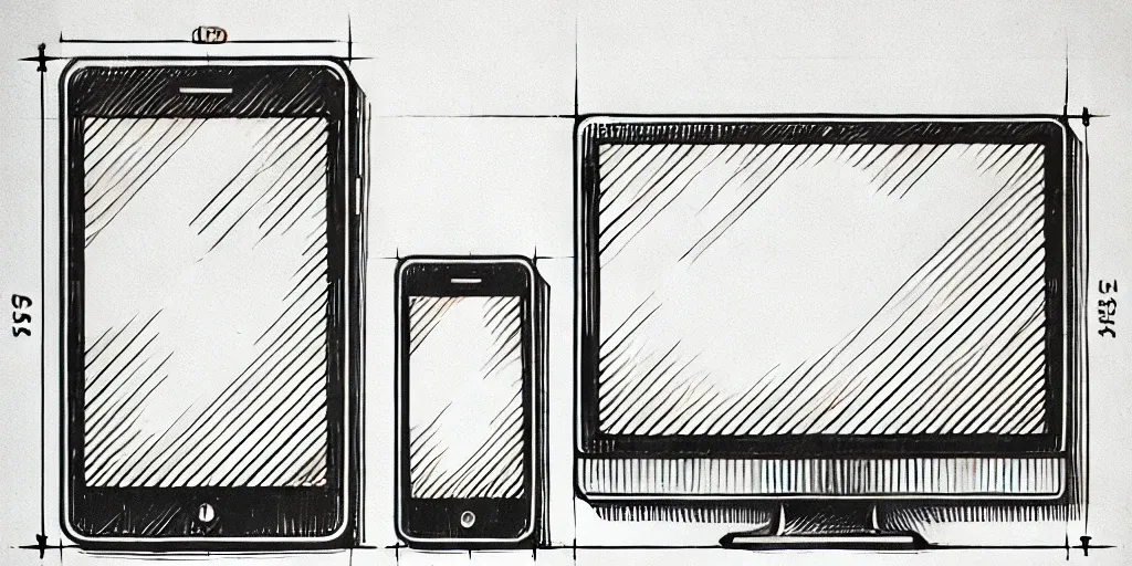
12 years later, does the approach still makes sense?
About the significant amount of media support types, the statistics confirm what was predicted 12 years ago.
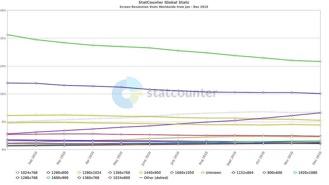
Worldwide screen resolution statistics - 2010
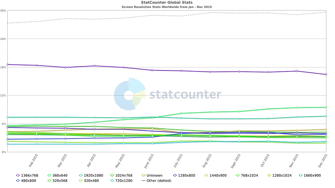
Worldwide screen resolution statistics - 2015
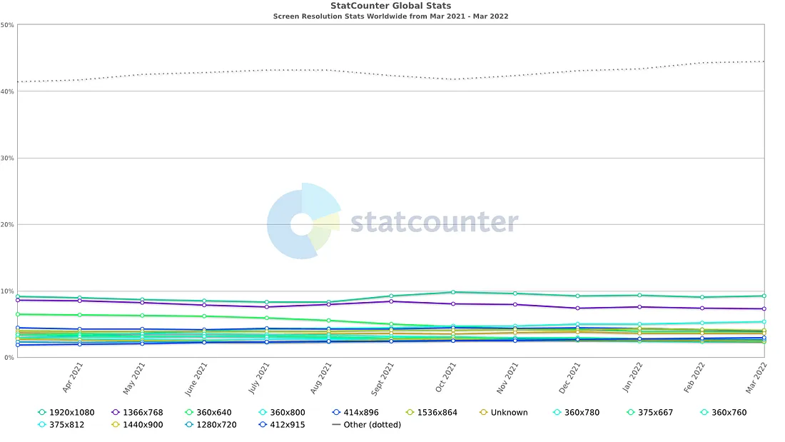
Worldwide screen resolution statistics - 2022
(Source: https://gs.statcounter.com/screen-resolution-stats)
The screen width range to cover, based on worldwide screen resolution statistics, matching more than 2% of the market
| SMALLEST WIDTH (PX) | GREATER WIDTH (PX) | |
|---|---|---|
| 2010 | 800 | 1680 |
| 2015 | 320 | 1920 |
| 2022 | 360 | 1920 |
% of « atypical » screen sizes (not included in the top 20)
2010 : ≃ 9%
2015 : ≃ 28%
2022 : ≃ 43%
The range of the most common screen widths has not significantly changed in 2024, and the percentage of atypical resolutions remains stable. It is noted that the representation of the 1366 x 768 resolution continues to decline, while the 360 x 800 resolution is on the rise, though without any major impact.
Adding the expansion of the digital market, and the increasing offer, is making the competition fiercer. Maximise the user experience of most of the users became a paramount issue for all the market players.Responsive Design is now more relevant than ever.
Responsive design, the evolution
The Media Queries usage was refined, and soon enougth the best practices move the media query from layout to content:
- To cover an ever increasing number of different screen sizes
- To match the modular conception, by components, made by developers
Indeed, as early as 2013, Brad Frost addressed the issue of design being centered around screens/pages, while development shifted towards components that are modular and reusable.
Then he creates the Atomic Design concept, and publishes a book in 2015 about it, popularizing this approach.

Atomic Design Methodology
Some issues are still not solved:
- The responsive system by media queries complicates the code and its maintenance, because of the generated duplication.
- The growing of « atypical » screen sizes to support creates an increase of media queries for an effective covering without quality loss for all users, getting the 1st point worse.
- To reuse a same component in different layouts, the behaviour of the component depends on its place on the layout, not on the window size.
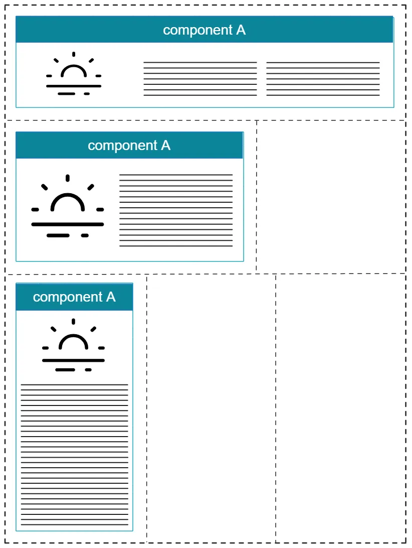
To illustrate point 3, the same component in 3 different areas:
Large screen

Small screen
The same component is diplayed in 3 different ways on the 3 layouts for large screens, but in the same way on small screens.
In a modular approach, the component has its own CSS, applying only to it. Each page also have their own CSS.
It is tempting to make adjustments on a case-by-case basis by overriding the CSS of a specific instance of a component with the CSS of the page that hosts it.
Using the page's CSS to change the component display on this page is working, but is a dangerous practice : in case of modification of the component structure, there is a real risk that the page's CSS won't work anymore.
A tempting but flawed approach..
Using the page's CSS to tweak how a component looks on that page can work, but it's a risky (and short-sighted) approach. If the component's structure or style changes later (like with a library update or design system change), there's a good chance the page-specific CSS will break or no longer work with the updated version of the component.
As a consequence, every page linked to this component have to be checked.Or, you might end up avoiding updates altogether.
It is not very strong or maintainable…
2021 : Naissance officielle des Container Queries
CSS Container Queries were introduced in beta in Chrome 93. The feature is still experimental and needs to be manually enabled through Chrome flags.
Since February 2023, this feature has been fully supported on the latest devices and browser versions. container - CSS: Cascading Style Sheets | MDN (mozilla.org)
A polyfill is also available if needed on the Google Chrome Labs GitHub. https://github.com/GoogleChromeLabs/container-query-polyfill
Responsive design today: full responsiveness without media queries.
Container queries are essential for handling adaptive design based on the size of the parent container.
In the case of a full responsive design, an other solution is to combine the power of flex and grids with mathematical functions, with a little of relative units, to make a responsive integration based on the component, taking into account the size of its parent and the screen, while not using Media Queries anymore.
I won't explain here flexbox nor grids, as other mathematical functions in css, because some other people already done it very well.
For information, here is a list of articles:
Guide to flexbox | Guide to grid | Auto-placement in CSS Grid Layout | Mathematical functions
Exemple : un dashboard full responsive sans media queries
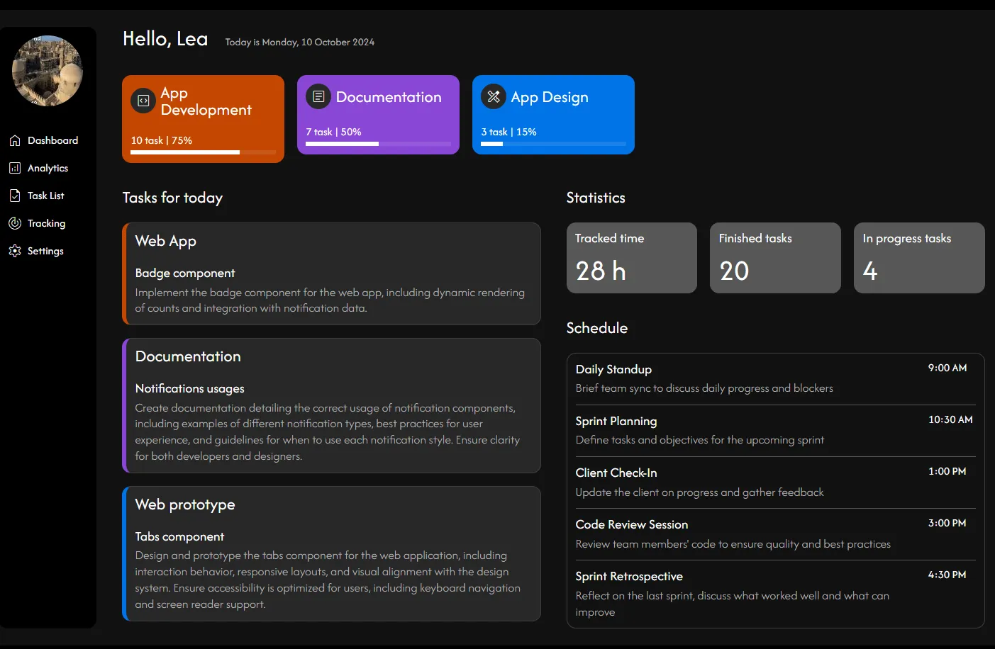
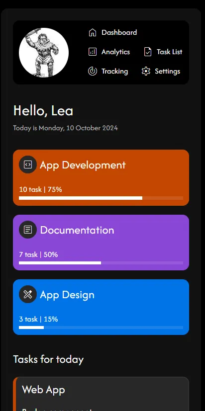
The CSS properties used in this example:
- flex and flex-basis: for a 2-column layout with unequal column widths.
The header uses the same method as mentioned above.
- grid, grid-template-columns: the distribution of the blocks in the right-hand column.
Task block lists:
50% / 50% columns:
The statistics block list uses the same method as mentioned above.
Planning list: a fixed 2-column layout.
Summary of all CSS properties that manage the responsiveness of this example (excluding alignments).
The benefits
- No dependency, simple CSS
- Full responsive, no deteriorated display between two breakpoints
- Very light code and maintainability
- CSS of layout is not dependent of CSS of components
Requirements
- Requires a responsive design approach, not just fluid adaptive design. If the entire design was built around fluid adaptivity with graceful degradation, it will be challenging to achieve a fully responsive interface.
However, it's not impossible, as container queries now allow for precise handling of adaptive design cases. That said, the time saved in coding and maintenance will be lost.