 Manon Bouvant - Apr 7, 2023
Redesign of exFabrica logo
The starting point
Presentation of the creation process for the new logo of exFabrica.
exFabrica is an IT consulting and development company founded in 2020, specializing in the design and development of impactful bespoke solutions for businesses. In 2022, noting that its logo did not fully reflect its values, exFabrica initiated an internal process with its design team to create a new logo.
The existing: Original logo
The original logo represented a factory with stars, which condensed a number of symbols: the « factory » aspect, which is evident in the name « exFabrica », while ensuring a quality one would expect from a professional and industrial solution. The stars symbolized the premium aspect (similar to the hotel industry).
By straightening the logo vertically, one could also make out the E and the F, which are strong elements in the company's name.
However, many feedbacks have revealed a negative image that had not been identified at the time this logo was created: people saw the industrial side in the sense of « polluting industry », which, as you can imagine, was not at all the initial intention.
It was time for a change!
Redesign: New logo
The new exFabrica logo is the result of a meticulous and deliberate creation process that took into account the values and philosophy of the company. It represents the company's passion for innovation, as well as its commitment to quality and excellence.
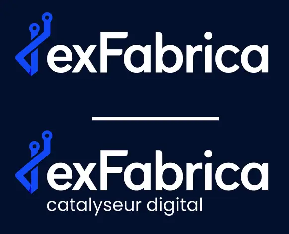
The baseline of the logo remains "digital catalyst." Through this element, exFabrica highlights its ability to be the element that allows to « trigger a reaction by its mere presence ».
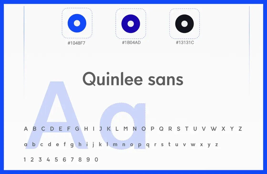
Color & typography
Creative Process: The Path
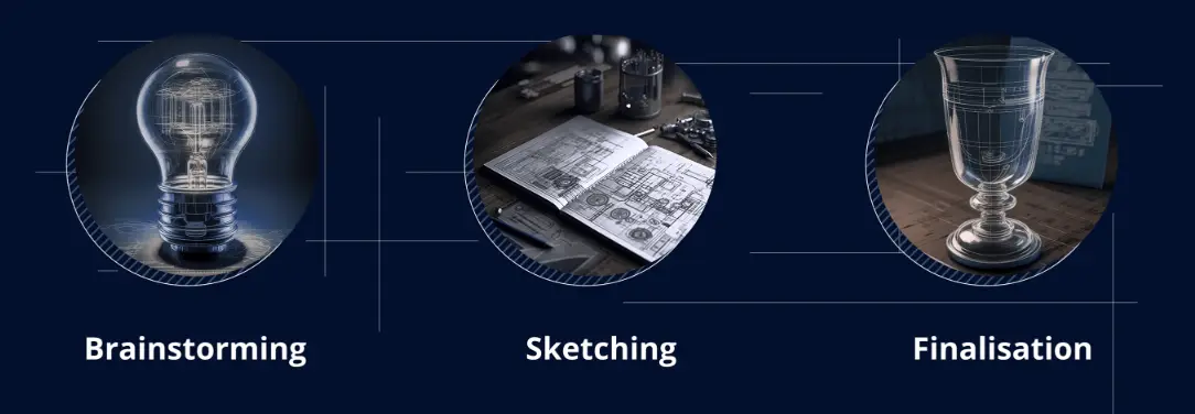
To avoid any confusion, exFabrica initiated the logo change project by relying on a meticulous creative process:
- Brainstorming
- Sketching
- Finalization
Concept: The result
To avoid any confusion, exFabrica initiated the logo change project by relying on a meticulous creative process: "There is another way" for digital projects, which can take them further. It represents the company's passion for innovation, as well as its commitment to quality and excellence.
Each choice was made intentionally and here are some key points for understanding:
The metaphor of the path
The logo represents two paths, two possible ways to achieve one's project. The classic path (the straight line) and also an "alternative path" sometimes more winding, more challenging, which exFabrica takes and can lead projects further and exceed initial expectations.
An adaptability
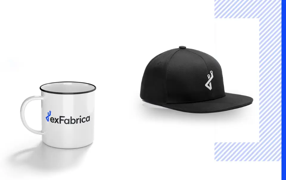
The logo has been carefully designed to be versatile and adapt to various contexts in which it will be used.
We have worked on several variations of color and size to ensure that the logo is always visible and prominently displayed on all media.
Bright color
The chosen color for our project is a strong blue, reminiscent of computing and cutting-edge technologies. This also helps to bring dynamism to the overall design, while projecting a modern and innovative image of our company.
A modern typography
To enhance the modern aspect of the logo, we opted for a round and distinctive typography called "Quinlee Sans". This typography sets itself apart from traditional fonts and adds a touch of modernity to the logo, making it contemporary and easily recognizable.
Declinations: Dark & light
The logo of our company has been carefully designed to be versatile and adapt to various contexts in which it will be used. We have created versions specifically for dark mode and light mode to ensure the logo remains visible and eye-catching, regardless of the environment it is in.
In application: A true identity
The team: working together
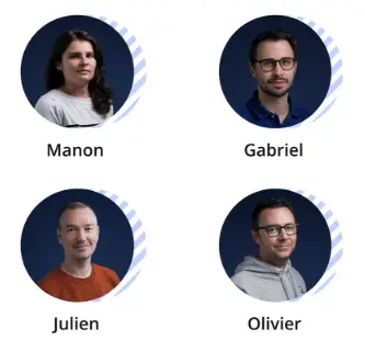
The new logo was created with the entire exFabrica team. This achievement required hours of work, collaboration, as well as numerous human and creative exchanges.
The team members worked together to find the best visual representation of the company. They discussed several ideas and ultimately chose the one that was most suited to their vision.
Thank you!
You will have understood that our team worked with passion and determination to create a logo that represents the values of our company. It was important for us to make an article about it and share this with the community.
Feel free to give us feedback! We love it.