 Grégory TAUDIN - Apr 5, 2022
Strapi: How to design a base UI and set settings?

Welcome back!
Until now, we talked about "Server API", back-end part of our Strapi plugin. In this new article, it's time to speak about front-end part: "Admin panel API".
To design and add some front-end stuffs inside the plugin, you need to know REACT. All Strapi interfaces are made with it.
Let's take a quick look at the structure of "admin" folder inside the plugin.
|--admin
    |--components (includes all plugin shared REACT components)
        |--Initializer
            |--index.js (Strapi required plugin initializer)
        |--PluginIcon
            |--index.js (Definition of plugin ICON)
    |--pages (Includes all plugin pages)
        |--App
            |--index.js (The default application component, you can define your UI routing here. Default route register homepage component (see below))
        |--Homepage
            |--index.js (the default homepage component. This is the default page when you click on the Strapi Admin website menu. The customization begins here)
    |--translations (Translation assets folder)
        |--en.json (EN translation file)
        |--fr.json (FR translation file, You can add your own here)
    |--utils (Includes some helpers)
        |--axiosInstance.js (Axios instance (Axios is a library to make HTTP calls and more))
        |--getTrad.js (helper to easily get translation text from your translation files)
    |--index.js (The plugin entry point. 2 importants functions:
        register() -> before Strapi plugin registering
        bootstrap() -> after Strapi plugin registering)
    |--pluginId.js (Helper to easily get the package.json: pluginId)
Custom plugin homepage
The purpose of this customization is to update the homepage with a Strapi compliant UI. Inside this new homepage, we need to define a header. Inside it, a button to access to settings and a button to start the analysis of Strapi Content-Type structure. Once done, the results will populate a DataGrid. On each DataGrid row, we will add an edit button to open a modal window. Finally, this modal will allow to update the contextual help text.
To update the homepage, open the file "api/src/plugins/awesome-help/admin/src/pages/HomePage/index.js". You'll notice that the page implements some components from Strapi Design components. All UI components can be found on these two documentation websites:
We use the <Main> component to create the base page layout.
The <HeaderLayout> component defines a standard Strapi page header. Inside you can find 2 interesting properties :
- primaryAction: it defines the main action of the page. For example, in the new HomePage, primaryAction launches the analysis process. You'll notice that we pass directly the Strapi UI <Button> inside the property.
- secondaryAction: create a button near the title. In this case, we put a Strapi UI <Button> with a simple redirection to plugin settings page (see the next chapter).
The <ContentLayout> defines the main container of the page. Inside you will find a loader <LoadingIndicatorPage> to indicate a page change.
We implement a Strapi DataGrid component <HelpTable> to display the analysis results.
To write some text into Strapi Admin UI, you need to use the <Typography> component. Don't forget to use the designed Strapi UI rules: https://design-system.strapi.io/typography
For the moment, the data are faked into an array. We'll use real calls from help API later.
Isolation of a component:
The component <HelpTable> need to be isolated into "api/src/plugins/awesome-help/admin/src/components/HelpTable" folder for a better code splitting. To create the new component, we need to create a base class named "HelpTable" and define a type with "HelpTable.defaultProps".
const HelpTable = ({data}) => {
  return <></>;
}
HelpTable.defaultProps = { data: [] };
In your type you define a property data of array type. With this type definition, you can write in the content of HomePage, this snippet:
The "HelpTable" DataGrid is ready to get some data. But we need to update these data: so, we'll create a new component to show a modal window.
In the folder "api/src/plugins/awesome-help/admin/src/components", create a new folder "ModalForm" with a "index.js" file inside. Copy and paste, inside, the code below:
This new component class has 3 properties:
- help object: the help object entity to update,
- onToggle: a function who shows / hides the modal window,
- onSave: a function to save the updated help object.
We use the <ModalLayout>, <ModalHeader>, <ModalBody>, <ModalFooter> Strapi UI components to structure the layout, header, body and footer of the modal window.
We use a "TextInput" component to input the contextual help content. Take care of onChange event who track the change of the field.
A "useEffect" function allows to set help object to an inner state hook ([innerHelp, setInnerHelp]). A "handleSubmit" allows to save the updated help object.
Now return to the code of HelpTable component:
We added a state hook ([isModalOpened, setIsModalOpen]) to manage the modal window. We also added a state hook to manage the selected row ([selectedRow, setSelectedRow]) when the user clicks on pencil button in DataGrid. Finally, In the REACT code : we add the <ModalForm> component with the 3 asked properties:
- onToggle that references the "handleToggle" function.
- onSave that references the "handleSave" function.
- Help that references the "selectRow" state.
When we save the help object into the fake array, we use the "toggleNotification" function from Strapi-helper plugin to notify the user for a success or an error.
The final code of HomePage:
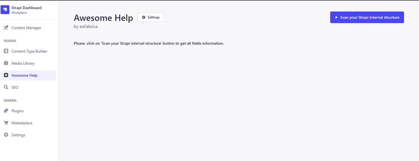
Homepage rendering
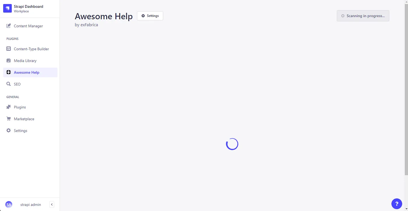
Scanning in progress
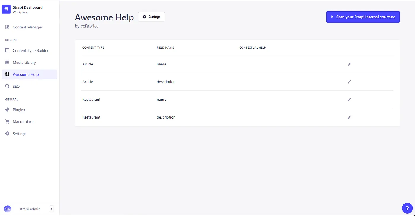
The "HelpTable" component with fake data
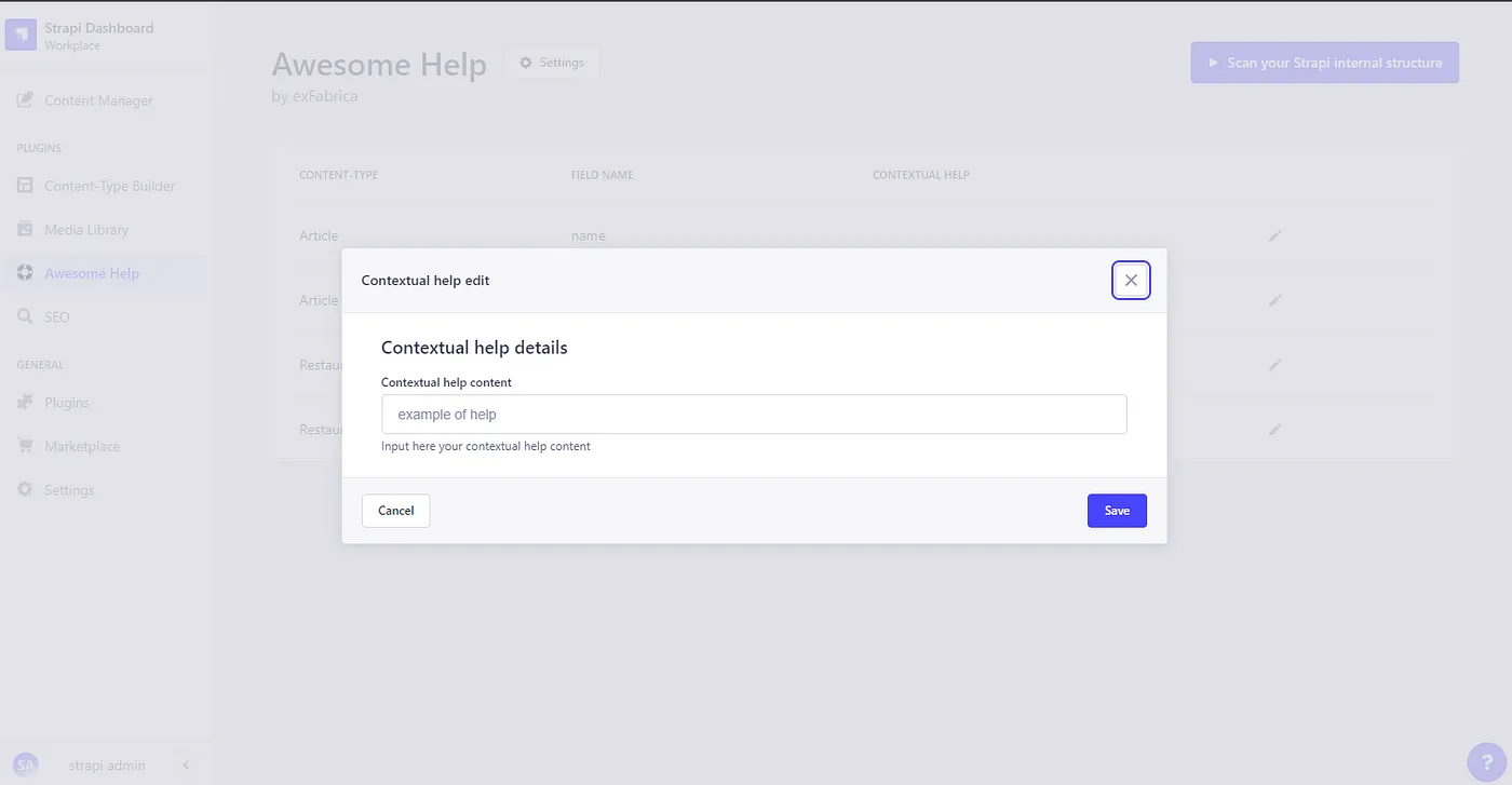
The "ModalForm" component to edit a row
The HomePage is now Strapi UI compliant and works!
Settings
To save our settings, we need to come back to "Server API" and create a Settings API. Once done, we'll create a proxy in Admin front-end to call this back-end API.
We need to save only one setting: the enable information. If true, we'll display the contextual help inside the documents. If false, the contextual help will be disabled.
We need to create a new route, a new controller and finally a new service. You'll notice that the type of this API is "admin". The front-end can call directly the back-end without permission.
The settings route:
GET verb to get the current settings and POST verb to update the current settings, simple!
The settings controller:
The controller just calls the service and return result.
Finally, the settings service:
strapi.store: this function from Strapi allows us to store some data from the plugin and needs to be called each time we have to access/write settings.
- getSettings function detects if the settings exists and create them (if not) in store.
- setSettings function set the settings and get it automatically from store.
Don't forget to reference route, controller and service in Strapi (see the previous article).
Let's return in "admin/src" folder, what are the next steps?
- We need to create a proxy to call backend from frontend.
- We need to create a component to display, save or update the plugin settings.
Create a new folder "proxy" inside "api/src/plugins/admin/src/api/settings-proxy" and inside put the code bellow:
With the help of Strapi-Helper plugin, we used the request function who allows to easily get the back-end "settings-api". As the type of settings-api is "admin", we don't need to add "api" in the URL.
We are ready to create the settings page and inject it into Strapi Admin website!
Settings page
To create our new page, we need to create a folder inside "api/src/plugins/awesome-help/admin/src/pages/Settings". From here, create an "index.js" file.
Put the code below into the file:
Code explanations:
- useEffect function is called when component is mounted by REACT. The "SettingsProxy.get()" gets the settings from store and uses the state hook to interact with REACT (https://reactjs.org/docs/hooks-reference.html#usestate) => When the hook binds the settings, the <ToggleInput> control is automatically set.
- handleSubmit function calls the "SettingsProxy.set()" function to store the settings.
On the UI part, we use <Box> component: a simple container highly customizable. A <Stack> component to stack internal components. A <Grid> to order controls. Finally, a <ToggleInput> control component with a "onChange" event to toggle the "enabled" setting property.
The last step consists of registering the page into Strapi. Open the "index.js" file in "api/src/plugins/awesome-help/admin/src". This file is the entry point of the "Awesome Help" plugin. Locate the function "register". You'll notice some interesting functions like:
- "app.addMenuLink" allows to inject Strapi Left Menu items.
- "app.registerPlugin" allows to inject the plugin into Strapi Admin base website.
Before this function, we'll insert new code to create a settings section and thereby use our Settings page.
We add through this function 2 entries: the principal: "Awesome Help" and a child: "General settings". This latter opens the page "pages/Settings".
Check the Strapi Admin website, go to Settings / Awesome Help / General Settings, you will find the settings page!
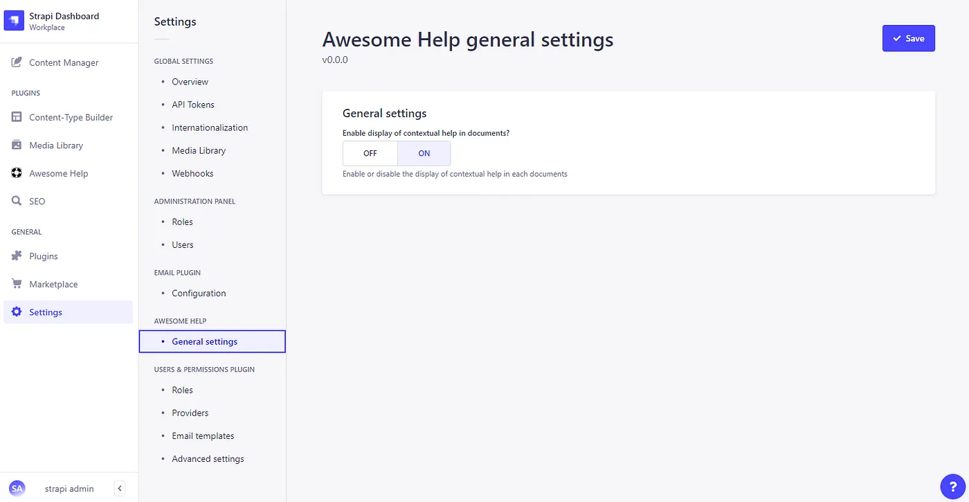
Settings Page
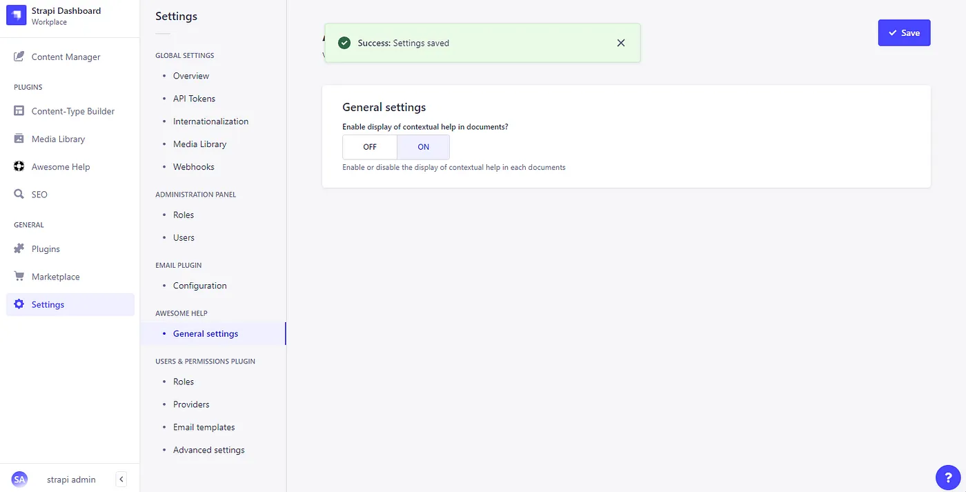
A ToogleNotification!
Perfect, exactly the behavior we expected!
Mission Complete!
We created a customized homepage, an injected settings page and finally a settings API!
And don't forget our GIT to get the code: https://github.com/ExFabrica/strapi-stories/tree/develop/part-3
See U!